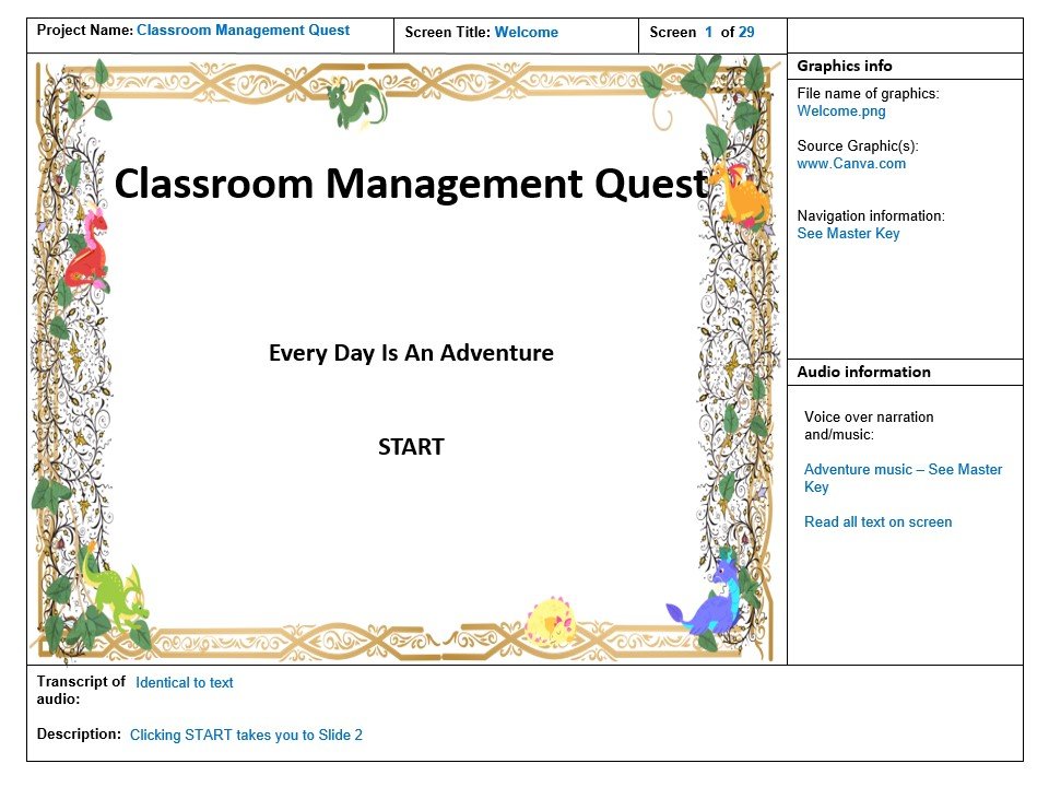
Classroom management quest

Audience: Staff at a Pre-K to 8th grade school in Chicago, IL
Skills: Instructional Design, eLearning Design, Analysis, Visual Design
Tools Used: Articulate Storyline, Canva, Screencastify, Microsoft PowerPoint
.the details
Many teacher education courses focus on theory rather than the more practical aspects of managing a classroom full of young learners. This lack of knowledge often leads to the implementation of guidelines and consequences that are doomed to fail from the start. During my first full-time classroom experience, I crashed and burned. I made so many mistakes, but I was driven to figure it out. I cultivated a fascination with interpersonal interaction - just how does one make people do something that they aren’t inclined to do in the first place? (Spoiler - you can’t!)
Over the years I developed a reputation for managing behavior, but it’s come after a lot of research, trial, and error. This interactive eLearning experience was designed as an introduction to a comprehensive course on classroom management for teachers at a K-8 school in Chicago, IL. It aims to equip teachers with the tools to manage student behavior, promoting improved classroom outcomes and cultivating a collaborative and positive environment for all.
.my Process
I began with a front-end analysis to determine knowledge gaps. In observing the school environment, I noted that instruction was frequently interrupted by students getting out of seats and otherwise distracting others. In response, instructors were increasingly stressed and resorted to yelling, sarcasm, and other negative speech. There did not seem to be a general understanding of what constituted a behavior issue, and situations that called for more nuance were treated as disciplinary issues.
I decided to focus instruction on the most basic of questions: What constitutes a behavior problem, and more importantly, what does not? To find out, I drew upon my own experience and that of other SME in the field to compose my instructional goals and learning objectives.
I began designing what I envisioned to be a sleek, professional experience… and quickly realized this would not resonate with my learners. As experienced professionals, they are often bombarded with training while struggling to manage enormous workloads. I realized that my learners would most appreciate creativity and uniqueness. When I came across Malone and Lepper’s theory of intrinsic motivation that highlighted “challenge, curiosity, control, and fantasy”, I realized I wanted to create a game-like atmosphere.
action map

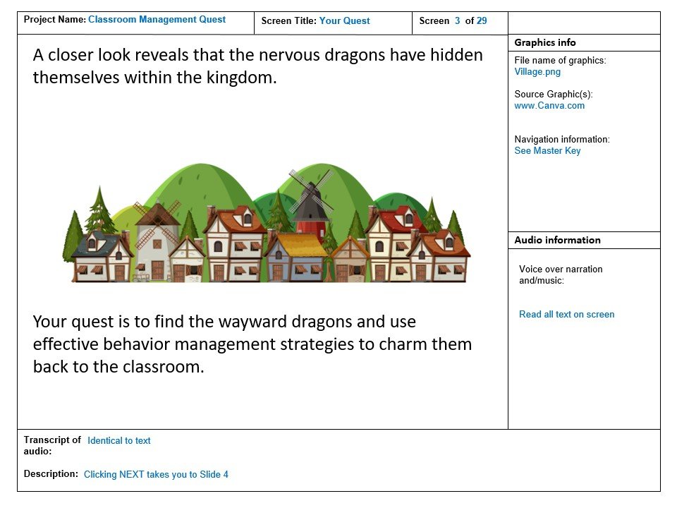
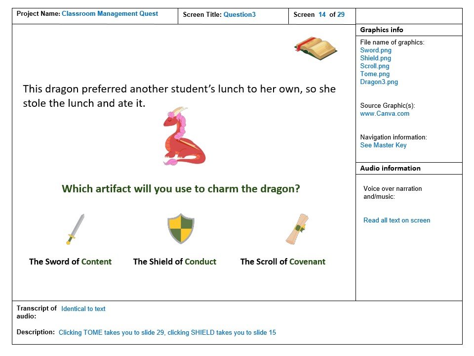
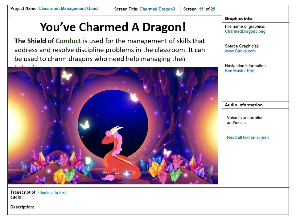
I wanted to present behavior issues and students in a way that didn’t seek to blame or alienate, so running with the ‘fantasy’ element, I used dragons in place of students. I wanted to be equally considerate with assessments given that my instruction is focused on teachers. In the end, I decided to design both formative and summative assessments using the “Pick One” method to reduce cognitive load and accessed by a small scavenger hunt. Since the end goal was for the learner to grasp the information as a part of a larger course of instruction, I decided to turn the assessments into another learning experience by providing specific feedback about each of the possible answers.
Storyboard

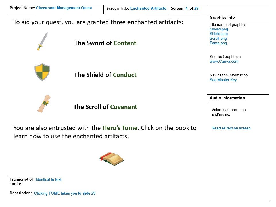
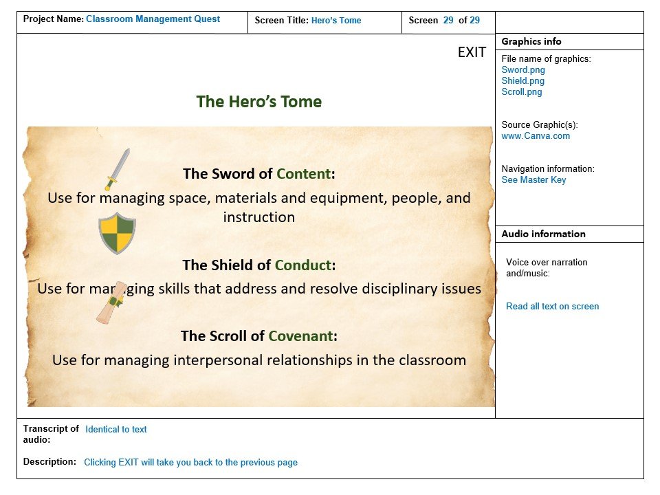
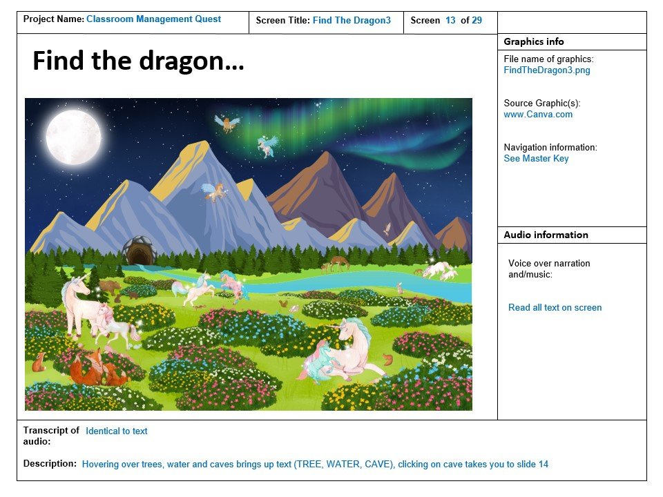
I kept the graphics and tone lighthearted in an effort to make what can sometimes be a touchy subject more user-friendly. I put together the fantasy art from various graphics with a comparable artistic style. In contrast with the fantasy theme and font choice, I designed the rest of the content and navigation to be more plain so as not to overload the learner. With accessibility in mind, I focused on simple and clear writing, increased font size, kept to a minimal color scheme with good contrast, and used a simple navigable menu. Though I used music, I was careful to keep it to the beginning and end slides.
Development
Working in Articulate Storyline, I continued with the graphics and theme already approved in my storyboard. I focused on user interactions and worked with layers, triggers, and variables. When I completed the course, I designed a usability test based on design choices, content, and navigation. Based on the feedback I received, I adjusted some of my assessments for improved clarity.
.Key Takeaways
Although I made the stylistic choice to design a more lighthearted course, I struggled with whether or not it would be perceived as professional. In the end, I realized that the staff participates in multiple professional trainings during the year, and that a change of pace would likely be appreciated. I also hoped to introduce this topic in a non-confrontational and informative way - I knew that some learners might be defensive or resistant to the content. Fortunately, learners were receptive to the content and seemed to enjoy the course. Prior to instruction, I tested the course with volunteers of different backgrounds, and all of them found the content east to understand and were able to complete the assessments without difficulty.
I’d love to connect with you!